MANAGEMENT
Research
PITCHFORK (https://pitchfork.com/)
Pitchfork is a music blog website that began as a newspaper and became online only. It is based primarily around Indie and experimental music. The way this website is laid out and what they blog about is very similar to how I could imagine my page. It covers music reviews, new releases, current events and music news.

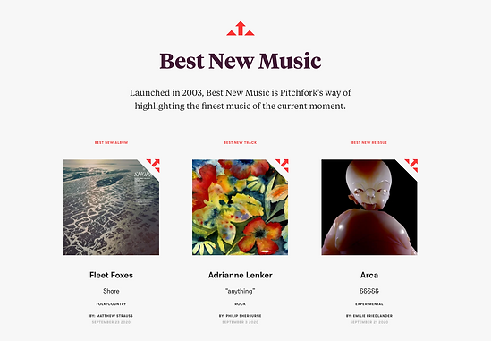
music review page
This is the music review page on Pitchfork's website. I really like the way they have laid this out with the album covers being the first thing to be seen, it's less writing which is appealing and easy to access, you click on what you know and what attracts you. When you click on the album it takes you to a full article. This is the kind of layout that I would like as it is eye-catching and grabs you as there's not too much writing.
new music page
Again with this page, they keep the same sort of theme and keep it eye-catching and simple. The theme is carried with the simple cover and then the article once it's clicked. I really like the way this looks and would like to transfer some of these ideas into my own website. I am wanting to do a similar thing but instead of just new music I want to do albums and songs that I've recently heard.
The Pitchfork website is very easy to access and navigate which is exactly what a website should be or else it isn't appealing. Who wants to go on a website that takes more brainpower to find your way around than creating it?
BROOKLYNVEGAN (https://www.brooklynvegan.com/)
BrooklynVegan is an American music website founded in 2004 and reports on events and music in primarily New York City. They make efforts to expose upcoming artists which is kind of what I am wanting to do too (focus on artists in the college)
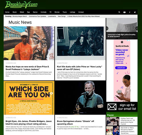
music home page
The way that BrooklynVegan lay out their website isn't my favourite. I personally don't find it very accessible and am not a fan of how much writing is exposed at first. I much prefer the layout of a website like Pitchfork, I think it is a lot more modern than BrooklynVegan. BrooklynVegan is way more crowded and clumped altogether than Pitchfork which is mostly pictures and is spaced in a good way. I wouldn't take a lot of inspiration from this website.
STEREOGUM (https://www.stereogum.com/)
Stereogum is a website that is based around music news, interviews and many other columns. They have a lot you can browse through.
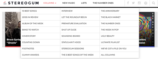
columns
The columns I have circled are things that I would be very interested in doing. I like the kind of things they write about and I will take inspiration from their columns for my page.
Local Musicians
- Henry Barnes (@henry.barnes.music)
- Yumi and the Weather (@yumiandtheweather)
- Credentials (@credentialsmusic)